Question: How is Trump portrayed in different news sources?
- Liberal
- Conservative
- Neither
Our Analysis
To answer our question, we web scraped the article titles from the 9 news sources’ politics page and/or opinion page over the span of this quarter. To see how we did it, check out our code. Once we web scraped the titles into a text file, we filtered out the titles based on the following key words:
whitehouse, trump, conway, sessions, pence, president, tillerson, devos, flynn, kushner, carson, department, preibus, bannon, spicer, and miller.
Once the titles were filtered, we wanted to see whether the more conservative news outlets used a positive tone in their titles about Donald Trump, whether the liberal news outlets used a negative tone when discussing Trump, and whether the news outlets that deem neither stance have neutral a tone.
To do this, we needed to use two essential Python packages:
- NLTK
- TextBlob
We used TextBlob to find the overall polarity (how positive/negative the words used are) and subjective the titles are. We predicted that the liberal news sources would be subjective and negative, the conservative news sources be subjective and positive, and the others be neutral and not subjective.
Our findings can be seen in the plots below. The first plot shows the polarity of the titles for each news source.
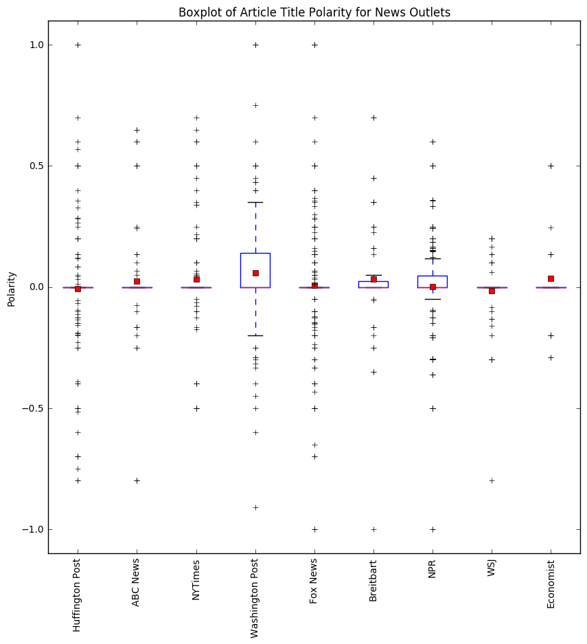
The liberal news outlets have a wide range of values for polarity, where most of the article titles are neutral, but overall seem to skew slightly towards positive article titles rather than to negative ones. The conservative news outlets also have many neutral titles, with slightly more positive article titles. This is especially true when we look at the boxplot for Breitbart, we can see that the majority of the boxplot range is positive. The "other" news sources seem to be more negative than positive, but they indeed have more neutral article titles.
The next plot showcases the subjectivity of each news outlet.
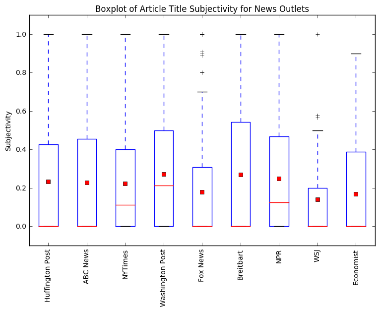
Each boxplot tells us how subjective the articles for each news source is, subjectivity is a number scaled from 0 to 1, where 0 is very objective and 1 is very subjective. The degree of subjectivity of article titles is important because it tells us how biased each of the websites are. From the boxplot, we can see that none of the news outlets are very subjective, but they have varying degrees of subjectivity. The least subjective news outlet is Wall Street Journal and the most subjective news outlets are Washington Post and Breitbart. Wall Street Journal was found to be more objective, and they also had more neutral and slightly negative article titles. Washington Post and Breitbart were found to be subjective, and they also have some of the more positive article titles in relation to the Trump administration. This does not completely match our assumption that The Washington Post would have more neutral to slightly negative news articles, because it is one of the more liberal news outlets (against Trump), while one of Breitbart’s old editors, is the current White House Chief Strategist (supporters).
After looking at the polarity and subjectivity of the article titles, we broke down the titles into noun phrases to further examine how the grouped news sources portrayed Trump and his administration. A noun phrase contains a noun and any words that modify it, this helps contextualize how Trump’s administration may be portrayed. Below is a table of percentage of polarity within noun phrases. The percentage was used because we had a various amount of noun phrases for different news source.
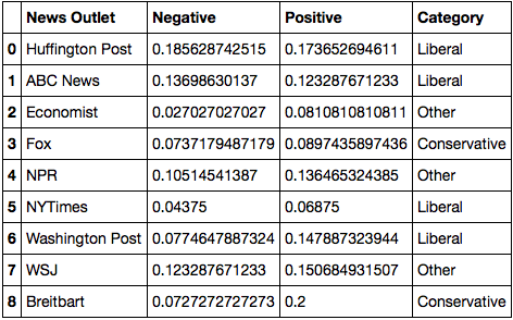
From the above table, we can see that the conservative news outlets has a higher positive than negative percentage which is expected. The other and liberal news source has a mix of negative and positive noun phrases but the percentages are pretty similar. Now we can see how the polarity for noun phrases perform in each news outlet category.
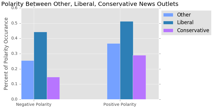
From the barplot above, conservative news outlets show consistency as their overall noun phrase polarity is more positive then negative. Other and liberal news outlets also show more positive noun phrase polarity than negative. An explanation for this is that noun phrases out of content with the whole article title may not show negativity or positivity accurately.
Comparing All Titles from News Sources
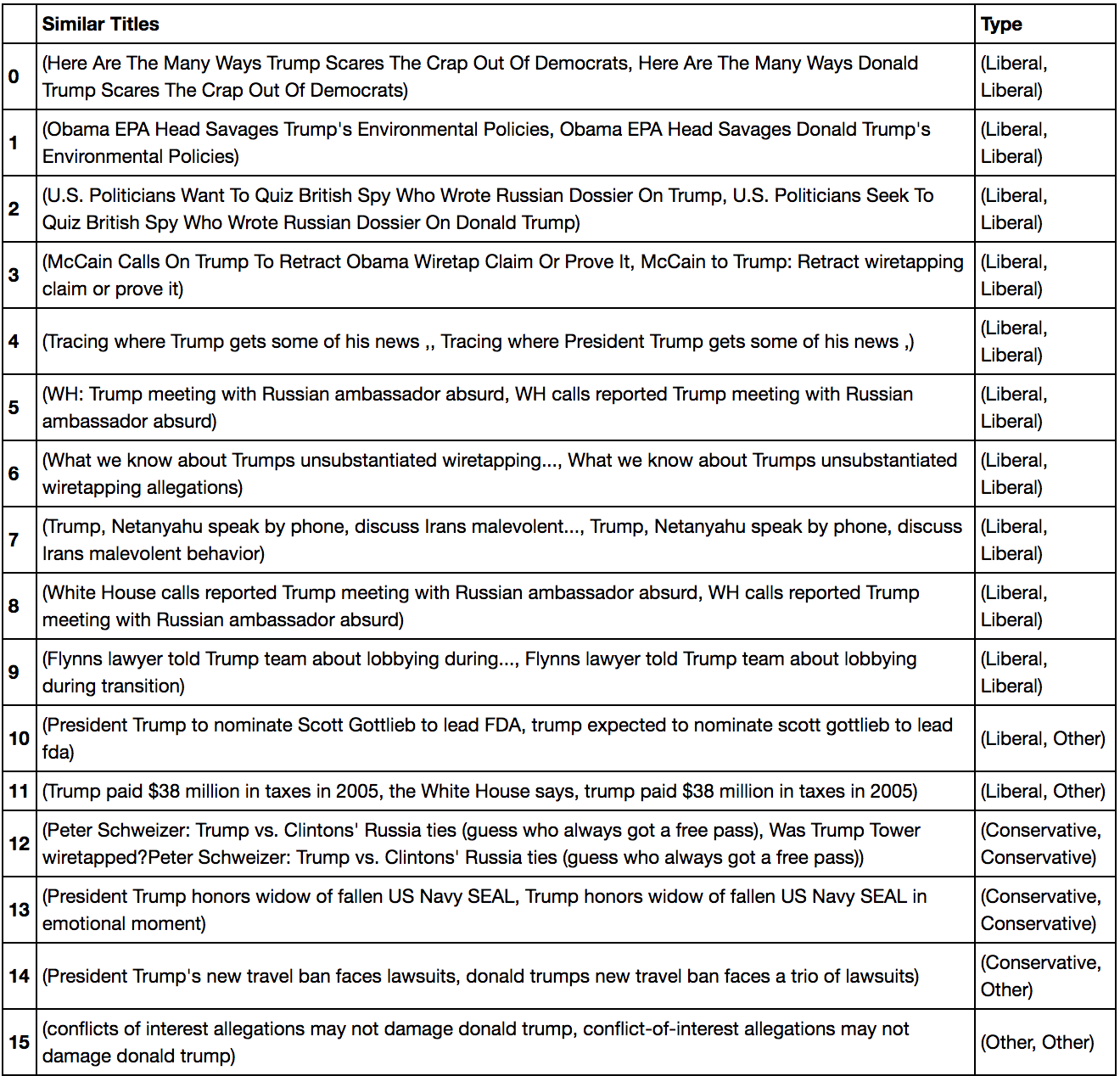
Since there did not seem to be a large difference between the polarity and subjectivity of the titles for the different kinds of news sources, we wanted to examine how similar the titles are from each other to see if Conservative news sources, Liberal news sources, and "Other" news sources report on similar topics. We applied pairwise comparisons of the article titles using the scikit-learn Python package. Our results are shown in the table below:
Word frequencies: What events each grouped news source frequently reports on
Breaking down the article title's one step further, we looked at the frequency of the words used. First, we removed the names related to Trump's Administration and stop words such as "the" and "that". Then using the Counter() function from the "collections" package will return the most commonly used words. We plotted the top 20 words used per category below:
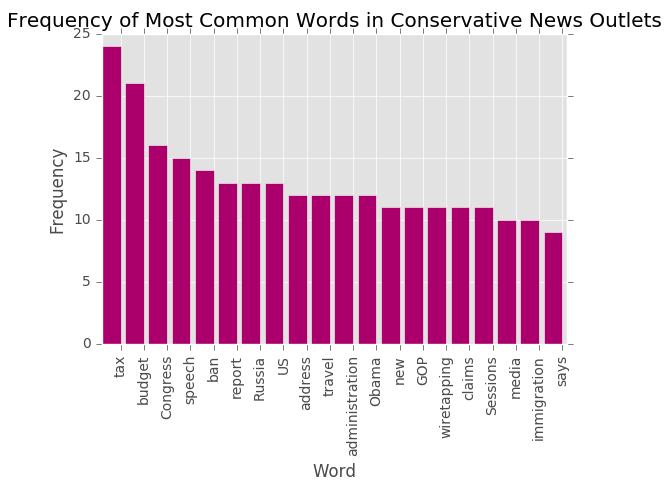
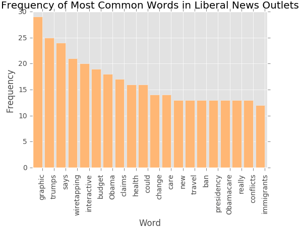
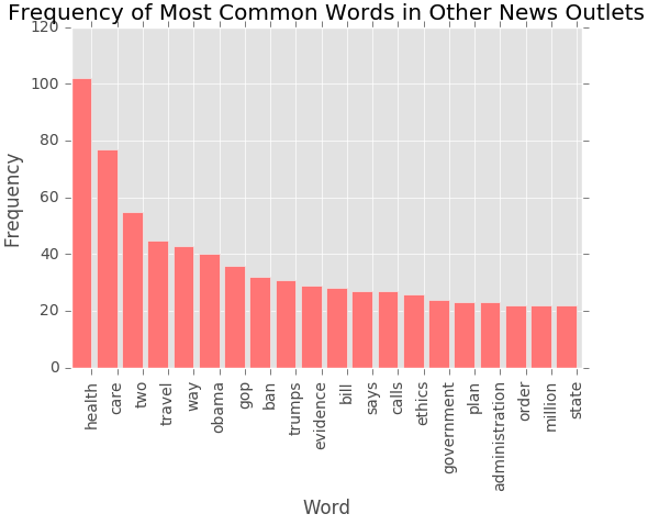
At first sight, we see that conservative and other news outlets have more nouns than verbs. Liberal news outlets have more verbs which could mean the titles are referring to events or sayings that the Trump Administration is involved, whereas more nouns are firm statements of events and topics that involve the Trump Administration. Conservative news outlets like to cover topics about taxes and budget. Other news outlets top content revolves around healthcare. Liberal news outlet maintain a balance between talking about the budget and healthcare. Some common words across all three categories of news outlets are Obama, travel, ban.
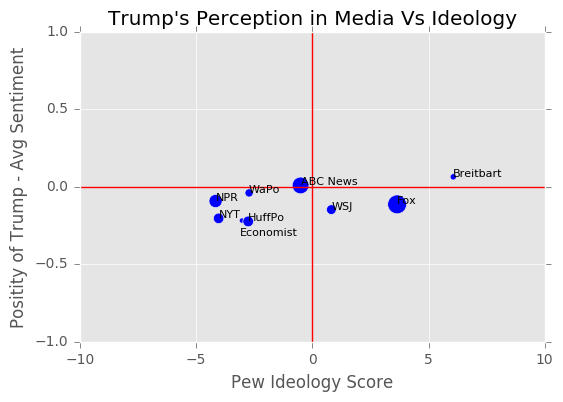
The Media's Ideology and Its Perception of Trump
In this section we observe how the viewer base's ideology of different websites affect their reporting on Trump. In order to get ideology scores we webscraped the Pew Reports website. We obtained the tables first and then split the tables using regular expressions. After creating the data frames we used Pew's scoring ideology scoring criterion: [-8.5 for extreme left, -4.5 for moderate left, 0 for neutral, 4.5 for moderate right, and 8.5 for extreme left]. Since we did not have Pew's survey data we first summed the rows, creating a total percentage of people that trust the news source. These numbers will represent the amount of people who actually believe the news source. We then divided each indivual value from the summed row allowing us to see the percentage of the makeup of people who trust this source. We then multiplied these valus by their respective group in the data frame and then summed across to get that news paper's average viewer base. These values will not necessarily be the same as Pew's actual scores due to Pew having ranges for each value between -10 and 10. However; this data was not openly available and in our case we thought this would give us a rough estimate of Pew's actual scores. Next, we obtained the size of viewership of each news source by summing the original trust percentages. This gave us a value that would illustrate how many people have actually trust of the news source. We then used this value to represent the size of people who trust the website, and this variable is illustrated in the plots below as the size of the dot.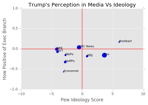
Confounding Variables
Our results are slightly different than what we expected. We thought there would be a huge difference in polarity levels between liberal and conservative news outlets, when in fact this was not the case.This is due to two main reason.
- Not enough data
- Sarcastic Titles
Having a big enough sample size is usually very important when conducting data. While we did have a good amount of article titles, we did not web scrape enough from each news outlet which led to some biased results. The table below shows the number of titles scraped for each news source.
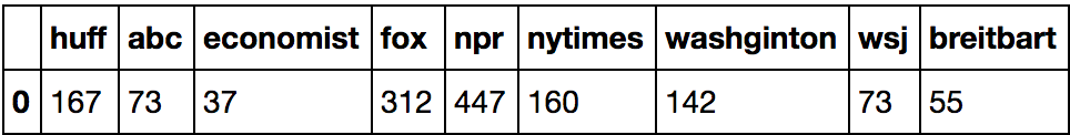
We clearly did not scrape enough titles for The Economist and Breitbart. This is largely due to the fact that the front page of their politics section didn't have as many titles and the front page was not updated as often/had different articles each day.
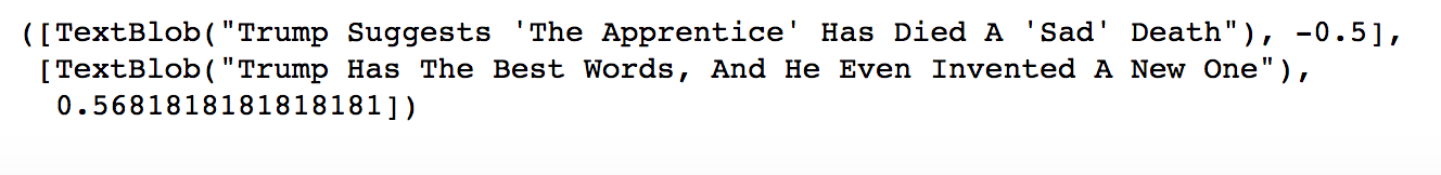
While TextBlob and NLTK are great for tokenizing words and getting an overall sentiment analysis, they do not take account language and sarcasm. We found that some of the titles that were deemed as positive were actually negative. These articles had a sarcastic undertone that the packages could not decipher. An example of a title that was marked as positive but was actually poking fun at Trump is shown below.